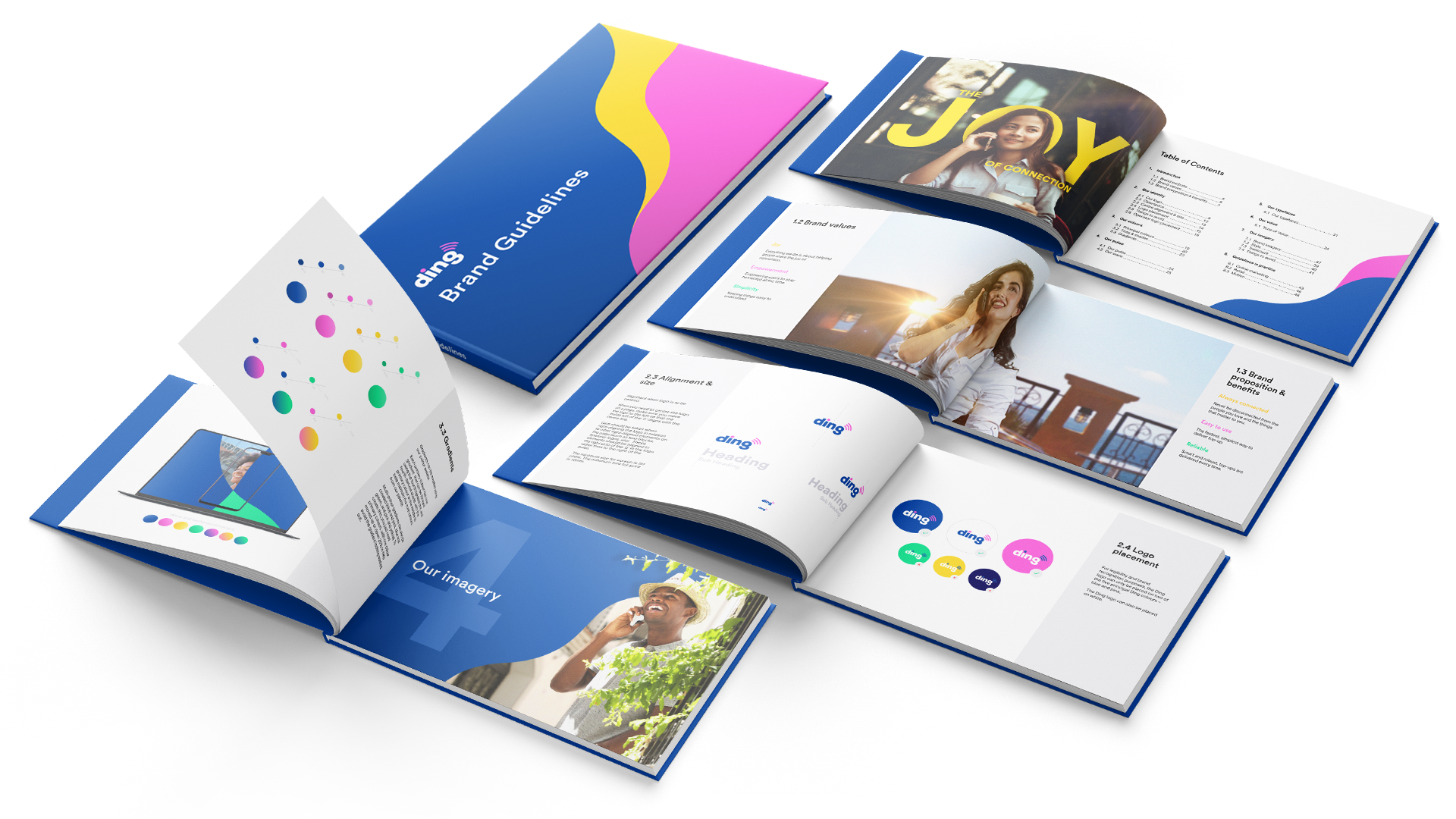


Ding is an international mobile company, with its corporate office in Dublin, Ireland.
In 2017, I worked on the company's new brand identity, following a brand refresh, which saw a new logo and tone of voice introduced.
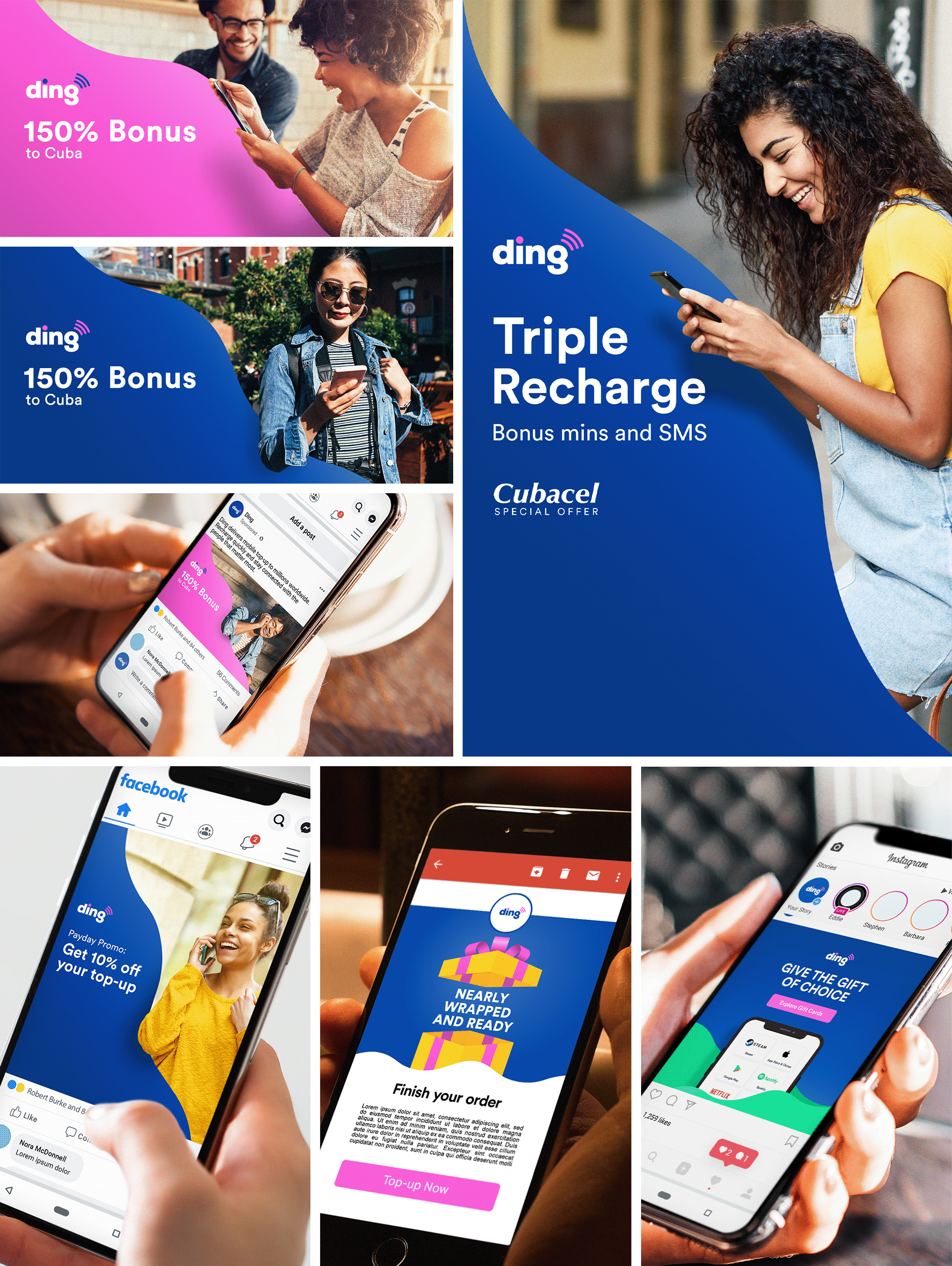
I was in charge of taking the new identifier - a connection symbol, titled the "Ding Pulse" - and apply it across our different platforms.
I was in charge of taking the new identifier - a connection symbol, titled the "Ding Pulse" - and apply it across our different platforms.
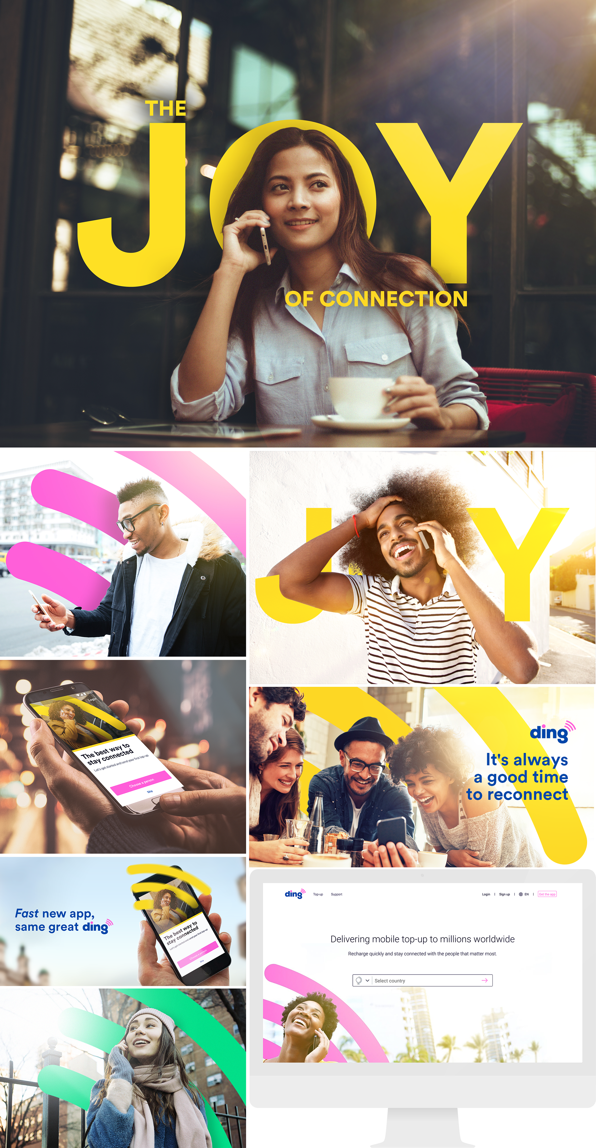
Using the companies new direction of "Joy", being the company's core tone of voice, I went about looking at how I could take a universal symbol and give it our own stamp.
The three bars aligned on top of each other are instantly associated with connection. It is a simplistic version of an antenna, with its three variations in size symbolising strength and distance. This solution subtly uses the shapes of the pulse, keeping the friendliness of the curves and rounded edges, but gives greater flexibility. Using the three bars of the pulse and aligning them horizontally enables us to keep the shape of the pulse, while communicating the message of connection in a different manner. The curves on the pulse can serve as a wave-like path that conveys movement.

The visual line of the wave creates a division on the page, highlighting the separation between sender and recipient. The flexibility of the new identifier enables the wave to be rotated, duplicated and filled with imagery or colour without losing its shape. It also enables the wave to be used across different platforms from the bright, loud nature of social media to the user-driven simplicity that exists on ding.com and the Ding app. It enables us to use our colours at different volumes, highlighting our joyful tone of voice while also leaving room for our product to remain clear and simple.
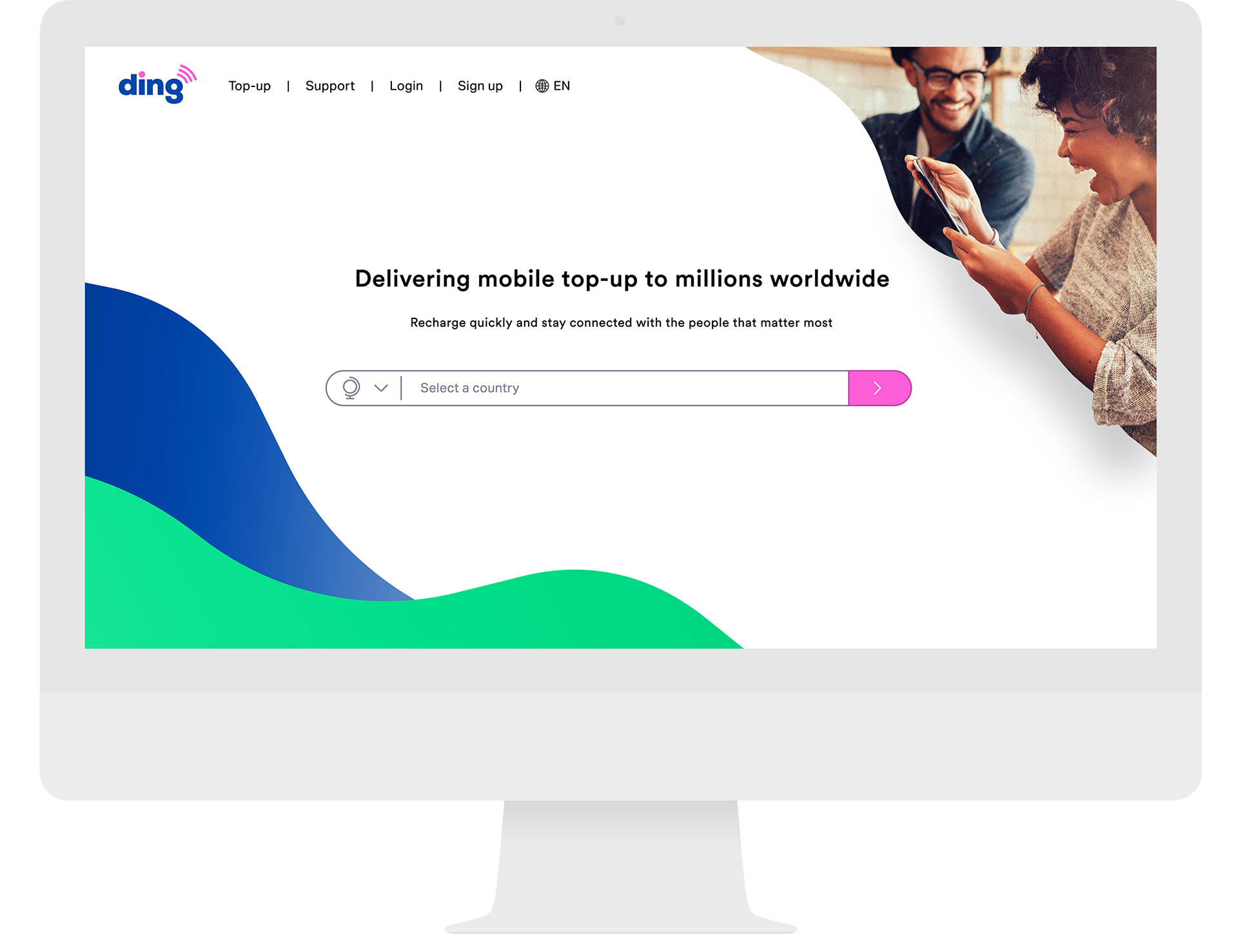
Imagery can also be contained within the identifier, leaving room for copy or any other piece of written information to be presented in a clean manner. This cleaner, more structured approach to our imagery allows us to showcase full, vibrant pictures, with a more atmospheric tone. It allows our imagery to be clear and uninterrupted by copy or the pulse symbol.
Motion content allows for greater flexibility when using colour. It opens up opportunities to use louder combinations due to the quick nature of the videos.
The wave concept works well as a transitional tool, and enables the brand to be presented in a colourful way. With the social media users having such a short attention span, it is important to present the viewer with fast-moving colours to draw them in.
Below are a few examples of motion content I have created, including short ads for Facebook and Instagram, and a brand awareness piece for St. Patrick's Day.
The entire 56-page brand guidelines I created for Ding can be found here: